Radio

Simple radio buttons
Inherits: LayoutControl, AdaptiveControl
Properties
-
active_color(ColorValue | None) –The color used to fill this radio when it is selected.
-
autofocus(bool) –True if the control will be selected as the initial focus.
-
fill_color(ControlStateValue[ColorValue] | None) –The color that fills the radio, in all or specific
ControlStatestates. -
focus_color(ColorValue | None) –The color of this radio when it has the input focus.
-
hover_color(ColorValue | None) –The color of this radio when it is hovered.
-
label(str) –The clickable label to display on the right of a Radio.
-
label_position(LabelPosition) –Defaults to
LabelPosition.RIGHT. -
label_style(TextStyle | None) –The label's style.
-
mouse_cursor(MouseCursor | None) –The cursor for a mouse pointer entering or hovering over this control.
-
overlay_color(ControlStateValue[ColorValue] | None) –The overlay color of this radio in all or specific
ControlStatestates. -
splash_radius(Number | None) –The splash radius of the circular Material ink response.
-
toggleable(bool) –Set to
Trueif this radio button is allowed to be returned to an indeterminate state by selecting it again when selected. -
value(str | None) –The value to set to containing
RadioGroupwhen the radio is selected. -
visual_density(VisualDensity | None) –Defines how compact the radio's layout will be.
Events
-
on_blur(ControlEventHandler[Radio] | None) –Called when the control has lost focus.
-
on_focus(ControlEventHandler[Radio] | None) –Called when the control has received focus.
Examples#
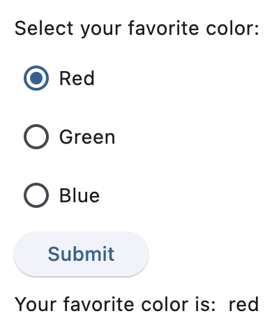
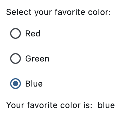
Basic Example#
Handling selection changes#
Styled radio buttons#
Properties#
class-attribute
instance-attribute
#
active_color: ColorValue | None = None
The color used to fill this radio when it is selected.
class-attribute
instance-attribute
#
autofocus: bool = False
True if the control will be selected as the initial focus.
If there is more than one control on a page with autofocus set, then the first one added to the page will get focus.
class-attribute
instance-attribute
#
fill_color: ControlStateValue[ColorValue] | None = None
The color that fills the radio, in all or specific ControlState states.
class-attribute
instance-attribute
#
focus_color: ColorValue | None = None
The color of this radio when it has the input focus.
class-attribute
instance-attribute
#
hover_color: ColorValue | None = None
The color of this radio when it is hovered.
class-attribute
instance-attribute
#
label: str = ''
The clickable label to display on the right of a Radio.
class-attribute
instance-attribute
#
label_position: LabelPosition = RIGHT
Defaults to LabelPosition.RIGHT.
class-attribute
instance-attribute
#
label_style: TextStyle | None = None
The label's style.
class-attribute
instance-attribute
#
mouse_cursor: MouseCursor | None = None
The cursor for a mouse pointer entering or hovering over this control.
class-attribute
instance-attribute
#
overlay_color: ControlStateValue[ColorValue] | None = None
The overlay color of this radio in all or specific ControlState states.
class-attribute
instance-attribute
#
splash_radius: Number | None = None
The splash radius of the circular Material ink response.
class-attribute
instance-attribute
#
toggleable: bool = False
Set to True if this radio button is allowed to be returned to an indeterminate state by selecting it again when selected.
class-attribute
instance-attribute
#
value: str | None = None
The value to set to containing RadioGroup when the radio is selected.
class-attribute
instance-attribute
#
visual_density: VisualDensity | None = None
Defines how compact the radio's layout will be.
Events#
class-attribute
instance-attribute
#
on_blur: ControlEventHandler[Radio] | None = None
Called when the control has lost focus.
class-attribute
instance-attribute
#
on_focus: ControlEventHandler[Radio] | None = None
Called when the control has received focus.